Graph Shows Iraq's Oil Production
 The always informative Stuart Staniford of The Oil Drum has a post on the world's oil production. The trends of the current picture are not clear but the numbers leave no doubt that we need to keep a close watch on what is happening worldwide.
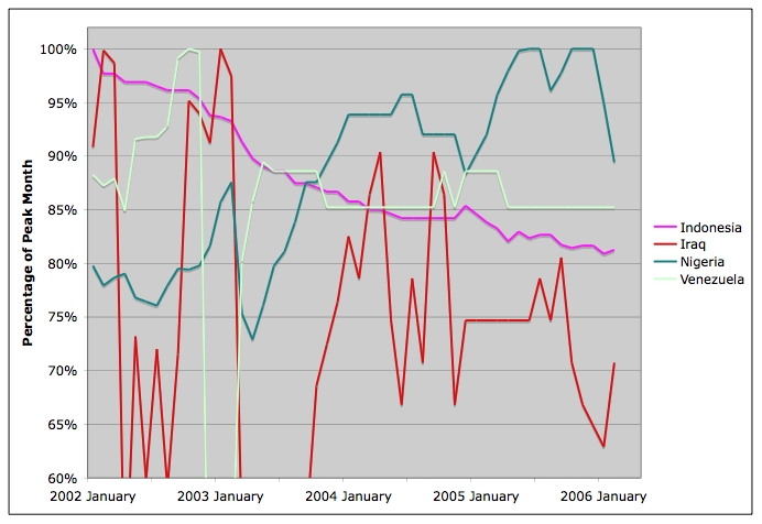
What interests me about the graph above is the red line showing the highly disrupted Iraqi production (a better picture can be had by going to The Oil Drum and clicking on the graph to get a much larger version). Keep in mind that the Bush Administration and its media friends fully expected before the war that Iraq's production might increase to almost double of what it was in January 2003 at its maximum. If the left side of the graph was labeled percentage of 'expected' production, the graph would truly be a pathetic statement of Bush Administration claims. Iraq has the world's third largest reserves but Bush's war has obviously interfered with production.
Further down, Staniford's post also contains a graph that shows declining production in Iran for the past few months. The reasons for the decline are uncertain and the possibilities range from political disruptions to ordinary production problems to possible hoarding in case of war or manipulation of the world's oil markets. When there is a lack of dialogue and openness between two countries, and our intelligience operations are disrupted by incompetent Bush officials, the facts are easily manipulated. But then, most Americans now know that about the presidency of George W. Bush.
posted by Craig at 4:19 PM
![]()
![]()


0 Comments:
Post a Comment
<< Home